
تاريخ الرياضيات

الاعداد و نظريتها

تاريخ التحليل

تار يخ الجبر

الهندسة و التبلوجي


الرياضيات في الحضارات المختلفة

العربية

اليونانية

البابلية

الصينية

المايا

المصرية

الهندية


الرياضيات المتقطعة

المنطق

اسس الرياضيات

فلسفة الرياضيات

مواضيع عامة في المنطق


الجبر

الجبر الخطي

الجبر المجرد

الجبر البولياني

مواضيع عامة في الجبر

الضبابية

نظرية المجموعات

نظرية الزمر

نظرية الحلقات والحقول

نظرية الاعداد

نظرية الفئات

حساب المتجهات

المتتاليات-المتسلسلات

المصفوفات و نظريتها

المثلثات


الهندسة

الهندسة المستوية

الهندسة غير المستوية

مواضيع عامة في الهندسة

التفاضل و التكامل


المعادلات التفاضلية و التكاملية

معادلات تفاضلية

معادلات تكاملية

مواضيع عامة في المعادلات


التحليل

التحليل العددي

التحليل العقدي

التحليل الدالي

مواضيع عامة في التحليل

التحليل الحقيقي

التبلوجيا

نظرية الالعاب

الاحتمالات و الاحصاء

نظرية التحكم

بحوث العمليات

نظرية الكم

الشفرات

الرياضيات التطبيقية

نظريات ومبرهنات


علماء الرياضيات

500AD

500-1499

1000to1499

1500to1599

1600to1649

1650to1699

1700to1749

1750to1779

1780to1799

1800to1819

1820to1829

1830to1839

1840to1849

1850to1859

1860to1864

1865to1869

1870to1874

1875to1879

1880to1884

1885to1889

1890to1894

1895to1899

1900to1904

1905to1909

1910to1914

1915to1919

1920to1924

1925to1929

1930to1939

1940to the present

علماء الرياضيات

الرياضيات في العلوم الاخرى

بحوث و اطاريح جامعية

هل تعلم

طرائق التدريس

الرياضيات العامة

نظرية البيان
Connecting data
المؤلف:
Tony Crilly
المصدر:
50 mathematical ideas you really need to know
الجزء والصفحة:
207-2013
20-2-2016
2120
How are two sets of data connected? Statisticians of a hundred years ago thought they had the answer. Correlation and regression go together like a horse and carriage, but like this pairing, they are different and have their own jobs to do. Correlation measures how well two quantities such as weight and height are related to each other. Regression can be used to predict the values of one property (say weight) from the other (in this case, height).
Pearson’s correlation
The term correlation was introduced by Francis Galton in the 1880s. He originally termed it ‘co-relation’, a better word for explaining its meaning. Galton, a Victorian gentleman of science, had a desire to measure everything and applied correlation to his investigations into pairs of variables: the wing length and tail length of birds, for instance. The Pearson correlation coefficient, named after Galton’s biographer and protégé Karl Pearson, is measured on a scale between minus one and plus one. If its numerical value is high, say +0.9, there is said to be a strong correlation between the variables. The correlation coefficient measures the tendency for data to lie along a straight line. If it is near to zero the correlation is practically non-existent.
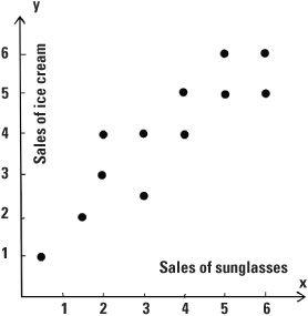
We frequently wish to work out the correlation between two variables to see how strongly they are connected. Let’s take the example of the sales of sunglasses and see how this relates to the sales of ice creams. San Francisco would be a good place in which to conduct our study and we shall gather data each month in that city. If we plot points on a graph where the x (horizontal) coordinate represents sales of sunglasses and the y (vertical) coordinate gives the sales of ice creams, each month we will have a data point (x, y) representing both pieces of data. For example, the point (3, 4) could mean the May sales of sunglasses were $30,000 while sales of ice creams in the city were $40,000 in that same month. We can plot the monthly data points (x, y) for a whole year on a scatter diagram. For this example, the value of the Pearson correlation coefficient would be around +0.9 indicating a strong correlation. The data has a tendency to follow a straight line. It is positive because the straight line has a positive gradient – it is pointing in a northeasterly direction.

Scatter diagram
Cause and correlation
Finding a strong correlation between two variables is not sufficient to claim that one causes the other. There may be a cause and effect relation between the two variables but this cannot be claimed on the basis of numerical evidence alone. On the cause/correlation issue it is customary to use the word ‘association’ and wise to be wary of claiming more than this.
In the sunglasses and ice cream example, there is a strong correlation between the sales of sunglasses and that of ice cream. As the sales of sunglasses increase, the number of ice creams sold tends to increase. It would be ludicrous to claim that the expenditure on sunglasses caused more ice creams to be sold. With correlation there may be a hidden intermediary variable at work. For example, the expenditure on sunglasses and on ice creams is linked together as a result of seasonal effects (hot weather in the summer months, cool weather in the winter). There is another danger in using correlation. There may be a high correlation between variables but no logical or scientific connection at all. There could be a high correlation between house numbers and the combined ages of the house’s occupants but reading any significance into this would be unfortunate.
Spearman’s correlation
Correlation can be put to other uses. The correlation coefficient can be adapted to treat ordered data – data where we want to know first, second, third, and so on, but not necessarily other numerical values.
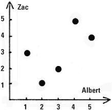
Occasionally we have only the ranks as data. Let’s look at Albert and Zac, two strong-minded ice skating judges at a competition who have to evaluate skaters on artistic merit. It will be a subjective evaluation. Albert and Zac have both won Olympic medals and are called on to judge the final group which has been narrowed down to five competitors: Ann, Beth, Charlotte, Dorothy and Ellie. If Albert and Zac ranked them in exactly the same way, that would be fine but life is not like that. On the other hand we would not expect Albert to rank them in one way and Zac to rank them in the very reverse order. The reality is that the rankings would be in between these two extremes. Albert ranked them 1 to 5 with Ann (the best) followed by Ellie, Beth, Charlotte and finally Dorothy in 5th position. Zac rated Ellie the best, followed by Beth, Ann, Dorothy and Charlotte. These rankings can be summarized in a table.


Spearman’s formula
How can we measure the level of agreement between the judges? Spearman’s correlation coefficient is the instrument mathematicians use to do this for ordered data. Its value here is +0.6 which indicates a limited measure of agreement between Albert and Zac. If we treat the pairs of ranks as points we can plot them on a graph to obtain a visual representation of how closely the two judges agree.
The formula for this correlation coefficient was developed in 1904 by the psychologist Charles Spearman who, like Pearson, was influenced by Francis Galton.

Measuring agreement between two judges
Regression lines
Are you shorter or taller than both your parents or do you fall between their heights? If we were all taller than our parents, and this happened at each generation, then one day the population might be composed of ten-footers and upwards, and surely this cannot be. If we were all shorter than our parents then the population would gradually diminish in height and this is equally unlikely. The truth lies elsewhere.
Francis Galton conducted experiments in the 1880s in which he compared the heights of mature young adults with the heights of their parents. For each value of the x variable measuring parents’ height (actually combining height of mother and father into a ‘mid-parent’ height) he observed the heights of their offspring. We are talking about a practical scientist here, so out came the pencils and sheets of paper divided into squares on which he plotted the data. For 205 mid-parents and 928 offspring he found the average height of both sets to be 68¼ inches or 5 feet 8¼ inches (173.4 cm) which value he called the mediocrity. He found that children of very tall mid-parents were generally taller than this mediocrity but not as tall as their mid-parents, while shorter children were taller than their mid-parents but shorter than the mediocrity. In other words, the children’s heights regressed towards the mediocrity. It’s a bit like top class batter Alex Rodriguez’s performances for the New York Yankees. His batting average in an exceptional season is likely to be followed by an inferior average in the next, yet overall would still be better than the average for all players in the league. We say his batting average has regressed to the average (or mean).
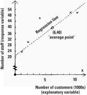
Regression is a powerful technique and is widely applicable. Let’s suppose that, for a survey, the operational research team of a popular retail chain chooses five of its stores, from small outlets (with 1000 customers a month) through to mega-stores (with 10,000 customers a month). The research team observes the number of staff employed in each. They plan to use regression to estimate how many staff they will need for their other stores.


Let’s plot this on a graph, where we’ll make the x coordinate the number of customers (we call this the explanatory variable) while the number of staff is plotted as the y coordinate (called the response variable). It is the number of customers that explains the number of staff needed and not the other way around. The average number of customers in the stores is plotted as 6 (i.e. 6000 customers) and the average number of staff in the stores is 40. The regression line always passes through the ‘average point’, here (6, 40). There are formulae for calculating the regression line, the line which best fits the data (also known as the line of least squares). In our case the line is ŷ = 20.8 + 3.2x so the slope is 3.2 and is positive (going up from left to right). The line crosses the vertical y axis at the point 20.8. The term ŷ is the estimate of the y value obtained from the line. So if we want to know how many staff should be employed in a store that receives 5000 customers a month we could substitute the value x = 5 into the regression equation and obtain the estimate ŷ = 37 staff showing how regression has a very practical purpose.
the condensed idea
The interaction of data

 الاكثر قراءة في هل تعلم
 اخر الاخبار
اخبار العتبة العباسية المقدسة

الآخبار الصحية


 قسم الشؤون الفكرية يصدر كتاباً يوثق تاريخ السدانة في العتبة العباسية المقدسة
 "المهمة".. إصدار قصصي يوثّق القصص الفائزة في مسابقة فتوى الدفاع المقدسة للقصة القصيرة
 (نوافذ).. إصدار أدبي يوثق القصص الفائزة في مسابقة الإمام العسكري (عليه السلام)


